services
Responsive website designing
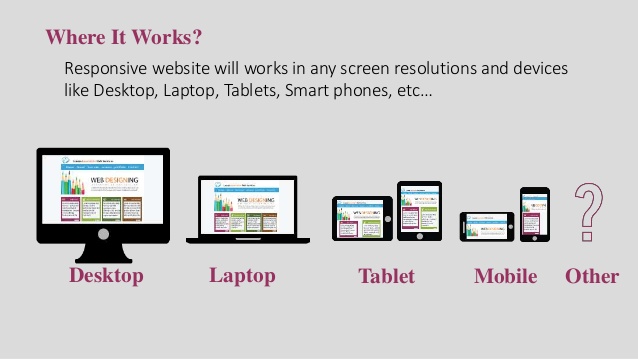
The world is confronted with various devices, screen sizes and resolutions. Managing different code base for different devices and resolutions is not an efficient solution. Responsive web design provides solutions by making websites and applications smart enough to resize and adapt its content based on the screen size of the device. This increases the development speed, makes project manageable and increases the usability.
Responsive web design builds on latest HTML5, CSS and JavaScript frameworks offering features such as media queries that identify a browser resolution and CSS scripts that adapt elements according the layout for particular device. In responsive web design, dimensions are given in percentages so that the design becomes fluid and adjust itself based on the browser window size. In one of the project, we have successfully migrated a mobile enabled website into mobile optimized website that can run on iPad, iPhone and Android devices with easy navigation and improved user experience.